Our good friends Scott and Alexa invited us to a fireworks display Monday night, so I loaded up my photo equipment and Ursula and I took off for the show.
Tripod + cable release + DSLR = the following pictures (look for more on Friday):
Our good friends Scott and Alexa invited us to a fireworks display Monday night, so I loaded up my photo equipment and Ursula and I took off for the show.
Tripod + cable release + DSLR = the following pictures (look for more on Friday):


Filed under Photography
As we found out in Wednesday’s blog article (Black & White Photography—It’s All in the Color!), many of today’s higher-end DSLR cameras come equipped with the ability to digitally “filter” for Black and White (B&W) photography. These digital “filters” come in yellow, orange, red, and green. But what the camera is actually doing when these “filters” are employed is digitally shifting the camera sensor’s individual red, blue, and green channels to emulate the use of an actual filter. It’s a nifty little trick, and it saves you from having to actually purchase a set of expensive filters for your different lenses to get the most out of your B&W photographs.
But what if you don’t have a DSLR? What if your camera doesn’t have digital “filtering,” and only records photographs in JPEG format? I was recently asked just these questions by a reader of this blog. So, Camille LaGuire of the Daring Novelist Blog, this article’s for you. Now, let’s see how to bring out the Ansel Adams in your JPEGs by using a very easy post-processing technique using one of my favorite FREE photo-editing software programs—Google’s Picasa (Link to Windows version) (Link to Mac version) (Link to Linux version).
Picasa is remarkably sophisticated for a free program. It never ceases to amaze me with its versatility and capabilities, and I’m still discovering features. In fact, I discovered the following nifty tool just yesterday when I started pondering Camille’s questions.
When you open a photograph in Picasa’s editing window, there are three tabs to the left of the image—“Basic Fixes,” “Tuning,” and “Effects.” Under the “Effects” tab are a dozen options, including the one concerning today’s topic. And, no, it’s not the “B&W” option in the top row, right column. Look further down, all the way down to the last row of options. The option we’re looking for is in the left column of the bottom row, the one marked “Filtered B&W.” Select that option and your photograph will immediately be stripped of all color and a small, multi-colored square labeled “Pick Color” will appear in the editing window.
Clicking on “Pick Color” brings up several options. The multi-colored square enlarges and an eyedropper appears in place of your cursor. Above this square is a line containing eight colored hexagons in the following order: light green, light yellow, yellow, intense yellow, light orange, orange, red, and finally dark green. Now this is truly amazing, because my Canon EOS 5D only gives me four filtering choices for B&W photographs. Picasa is giving me eight for far more control over B&W filtering effects.
And what are the effects? Take your eyedropper cursor and slide from left to right to find out. As we learned on Wednesday, the B&W filters most often used for landscapes are yellow, orange, and red, and that as you go up that scale anything that was formerly blue or green becomes darker while anything that was previously in the warmer range of colors (yellows, oranges, and reds) will brighten. Thus, if you’re editing a landscape, watch the sky darken and clouds suddenly pop out as you go up the scale from light yellow to red. Green foliage and blue pool water will also darken at the same time. Place the eyedropper over the light green hexagon and the sky lightens and clouds fade. Go to the dark green option and the fainter clouds closer to the horizon will disappear altogether while the water in the pool becomes almost white. If you’re editing a portrait, then you generally want to use the cooler green filters to darken skin tones and increase contrast.
But Picasa doesn’t just stop at a mere eight filtering possibilities. Take your eyedropper cursor back down to that enlarged multi-colored square. It’s actually a palette. Start moving your eyedropper around and watch what happens to your photograph. Suddenly, you’ve gone from just eight possible filtering effects to literally tens of thousands. Now that’s control.
Once you’ve found a filtering effect that you like, whether in the upper row of eight hexagons or in the enlarged filter effects palette below, left click your mouse to set it. If you’re still happy after you’ve set the effect, go down to the “Apply” button. If you want to do a bit more experimenting, just hit “Cancel.”
A word of caution: If you intend to use Picasa’s “Filtered B&W” tool, do not take your photographs in your camera’s B&W mode. When you do that, your camera discards the original color information. Picasa needs that color information in order to apply the filtering effects. If you take black and white photographs, Picasa cannot possibly figure out from the monochrome JPEG file what the original colors were, and thus cannot digitally “filter” those colors after the fact.
For today’s demonstrations, I chose three color JPEG photographs, all of which had minor adjustments made prior to conversion to B&W. No additional post- processing was done after B&W conversion except for Picasa’s filtering effects. What follows below are four columns in three rows. The pictures from left to right are: Color JPEG, Unfiltered B&W, Dark Green Filtering, and Red Filtering. I chose dark green and red for this demonstration because their effects on colors are the most intense and at the opposite ends of the spectrum—green filtering lightens greens and blues while darkening yellows, oranges, and reds; red filtering lightens yellows, oranges, and reds while darkening greens and blues.
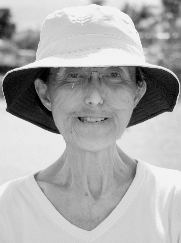
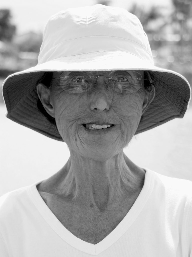
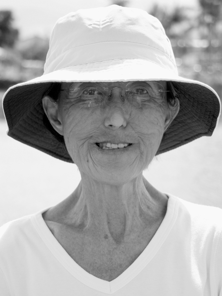
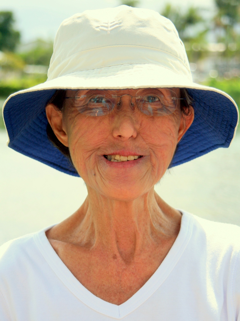
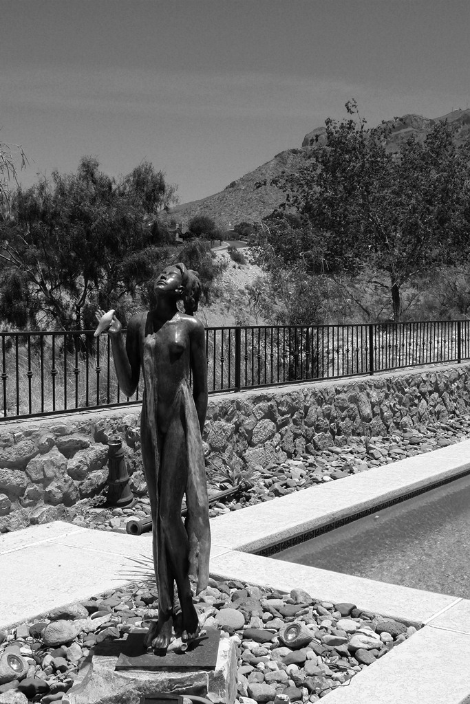
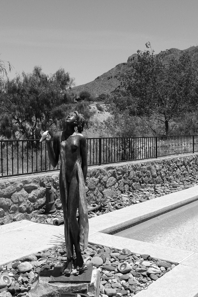
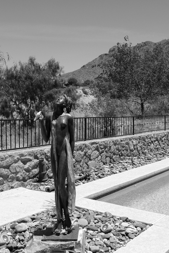
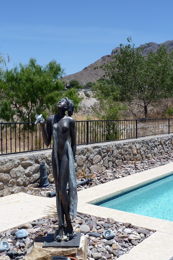
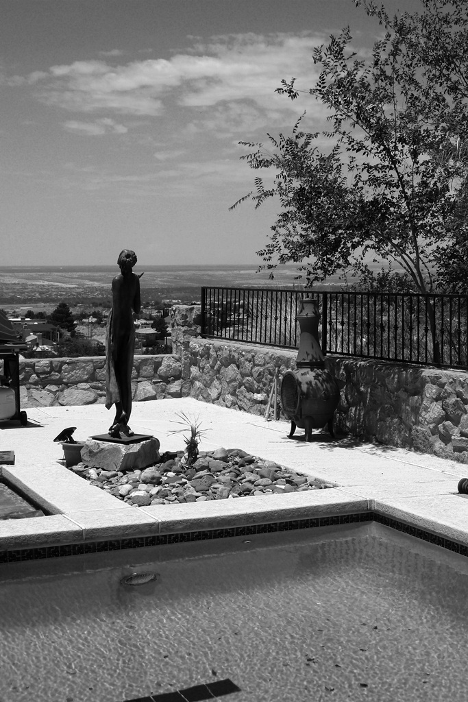
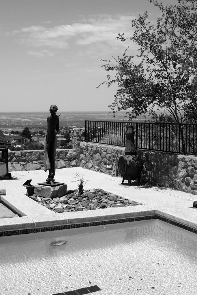
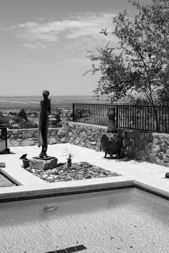
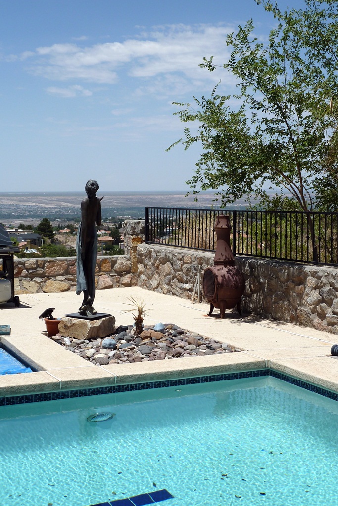
In the top row, notice how the red filtering (right-side photograph) shows the most dramatic sky and how that darkened sky brings out clouds in the background far better than the unfiltered version (second from the left). In the next row there is a very faint, wispy line of cirrus cloud cutting across the sky near the top. It’s just barely visible in the color and unfiltered versions, almost completely vanishes in green filtering (third from the left), and is the most prominent in the red filtered photograph.
But watch what happens when we go from landscapes to a portrait shot. If this case, we want to enhance the warm colors and suppress the cooler colors. This brings out more detail and contrast in the face, thus giving the portrait far more character than would otherwise be achieved without filtering. Suddenly, it’s the green filtering that really pops, while the red filtering washes out the face giving it an unflattering ghostliness that does nothing to enhance the subject.
So, there you have it. Don’t have an expensive DSLR with internal B&W digital filtering capability? You no longer need it. Download Google’s Picasa and your problem is solved. Indeed, you’ll have much more filtering control than your DSLR with its internal digital filtering capabilities could ever achieve.
Filed under Photography
Photography, even Black & White photography, is all about color. Yes, you read that correctly. It truly is all about the color. If you don’t believe me, take a look at some of Ansel Adams’ iconic work. There’s a secret to how he got those dramatic skies, puffy white cumulus clouds that popped right out at you, and those sharp tonal ranges and high contrast that gave his work an almost three-dimensional quality even though they were merely shades of gray. And that secret didn’t just start in the developing room; it started in his choice of colored filters.

There are four basic filters that a photographer uses in Black & White photography. For landscapes, flora, and still-life photography, those filters are usually yellow, orange, and red, mostly depending on how dark you want the sky and foliage. For portrait photography, green is the filter of choice as it increases the contrast and tonal range of most skin tones. (Note: Next time you watch an old B&W Three Stooges short, bear in mind that the actors are in green makeup. Same thing for the actors in most old B&W television shows. Back then, the actors were “filtered” rather than the camera lens.)
The choice of which filter to use depends on what spectrum of colors you want darker and what colors you want lighter. A red filter allows the red of, say, some recently harvested radishes to pass through the filter easily. Colors tending toward the greens and blues would be blocked. The result on a Black & White photograph is that your radishes would come out looking bright, but the attached leaves would be considerably darker. Substituting a green filter would darken the radishes and lighten the leaves.
But you may not need to purchase all those filters if you have a modern DSLR. Since color filtering is similar to white balancing, you can digitally apply color “filtering” in-camera, or even in post-processing on your computer using the software that came with your camera. But in order to obtain optimum control, you’ll need to shoot in your camera’s native raw format (see my two-part blog on raw versus JPEG: Link to Part 1 and Link to Part 2). Taking your pictures in raw will allow you to post-process the photograph with a digital yellow, orange, red, or green “filter,” or, since all sensor pixel information is retained in the raw file, you can make the photograph color again. Neat trick, huh? If you shoot in JPEG using your camera’s monochrome setting, you may want to take a series of shots using the different digital “filters” in your camera’s menu under the “Monochrome” picture style, then choosing which filtered effect worked best when determining which shots to keep.
For purposes of demonstration, all the photographs used in the rest of this article are minimally post processed to concentrate on the actual filtering effect rather than any demonstration of computer mastery. If I were processing these photographs for display or printing, I would go further in enhancing contrast and tonal quality, but then you wouldn’t know if you were comparing filtering effects or my post-processing techniques.
This first set of photographs show a multi-colored spring toy I like to use for color calibration. The first shot shows the rainbow spring in color (Canon Standard Picture Style). Following renditions (using Canon’s Monochrome Picture Style) are Unfiltered, Yellow Filtering, Orange Filtering, Red Filtering, and finally Green Filtering. Note how the yellow, orange, and red filters are basically just varying degrees of the same effect—gradually lightening the yellow-to-red range while darkening greens and blues. The green filter gives the opposite effect.
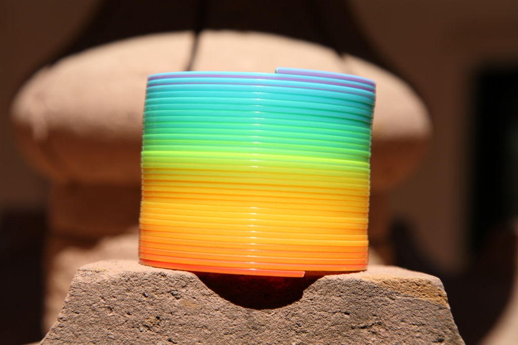
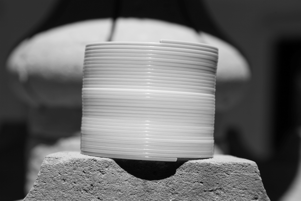
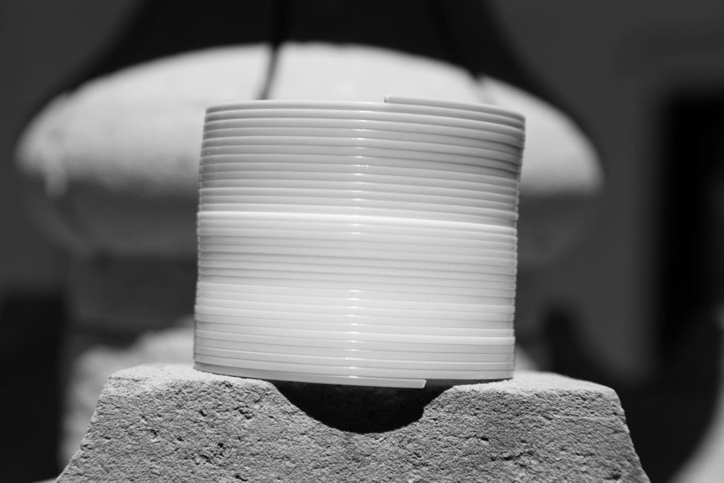
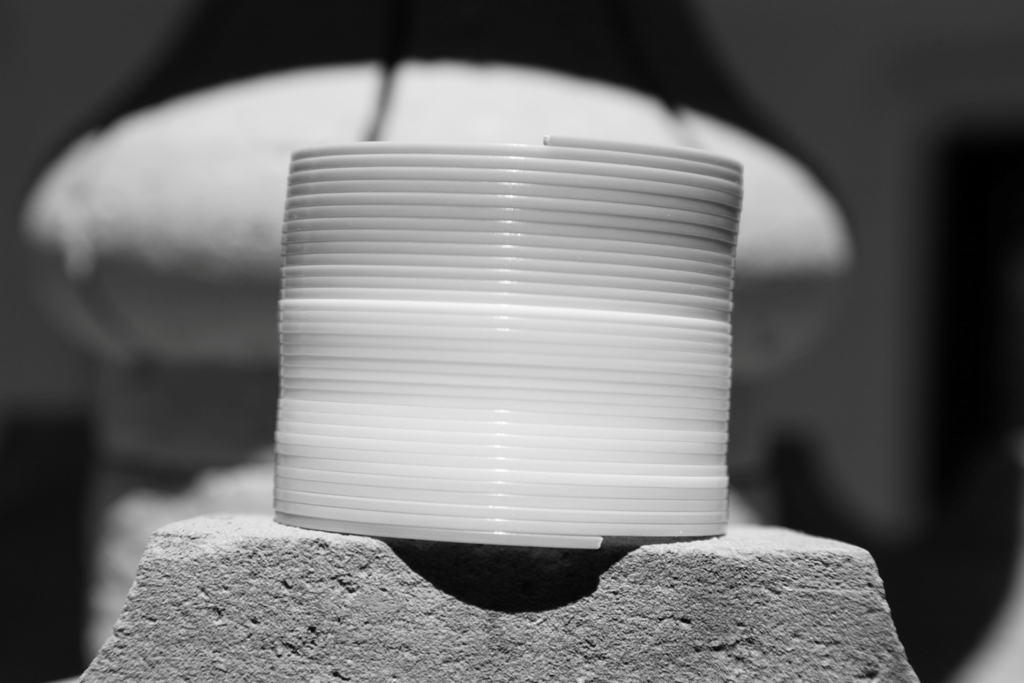
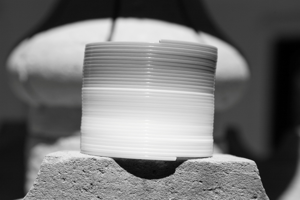
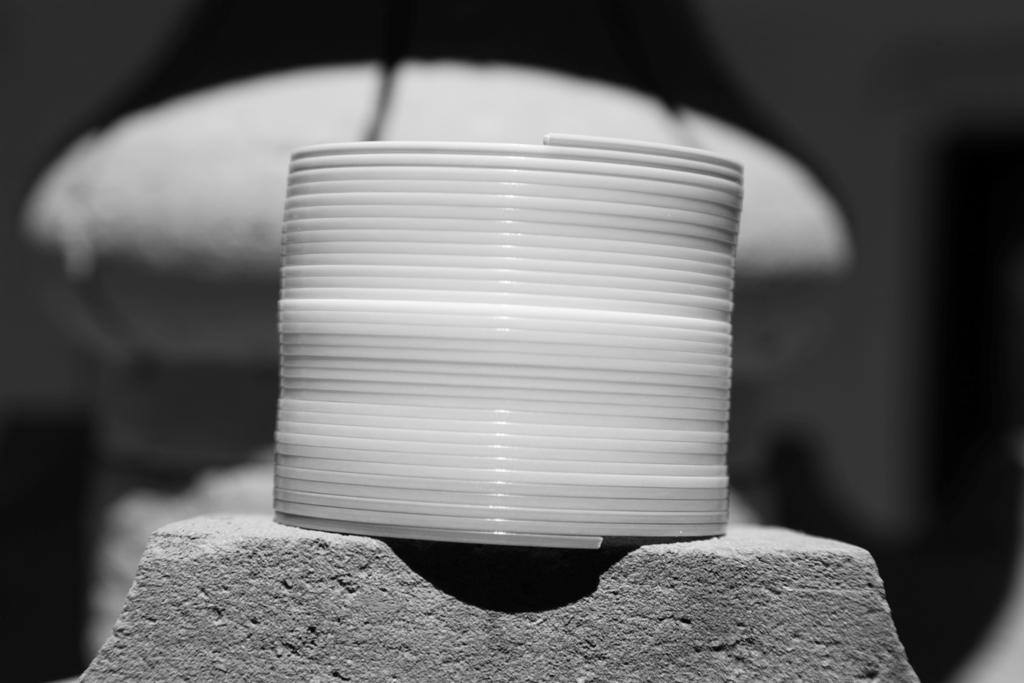
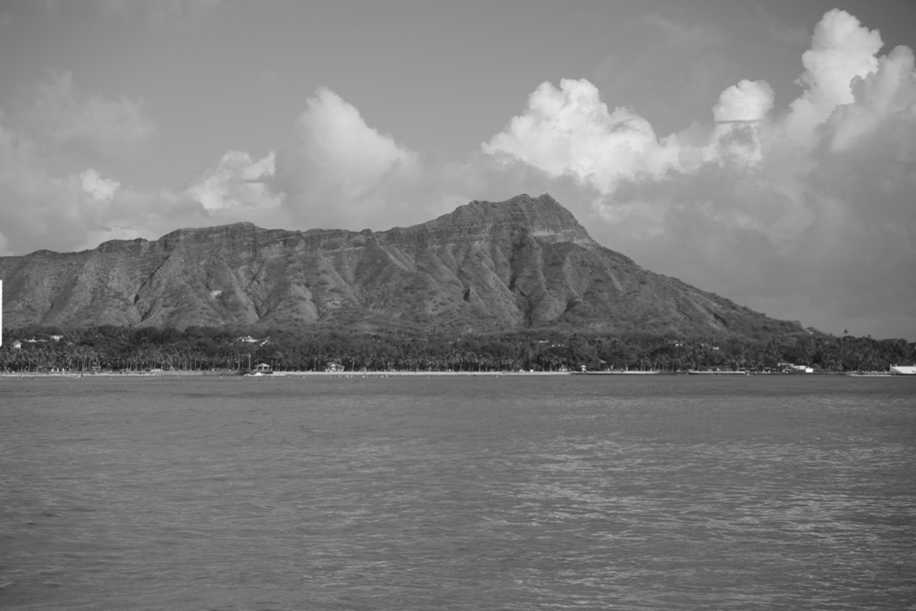
So, WWAAD? (What Would Ansel Adams Do?) What was his secret for those dynamic, awe-inspiring landscapes? How the heck did he do that? Well, besides some really fantastic artwork in the darkroom, involving some really advanced techniques over hours and hours of processing and developing, most of his more stunning works started out in the field with a dark red filter. So, there you have it. If you want the digital equivalent of Ansel Adams, start with your camera’s red filtering in its monochrome picture style. Throw in a Polarizing Filter (see Monday’s blog at this link) on top of that red filtering effect and your skies will darken even more, coming even closer to Ansel Adams’ much darker red filter. If you don’t want that much drama, you should at a minimum set your camera to yellow filtering for most landscapes because if you don’t throw in at least some filtering at the warm end of the spectrum (“warm” colors are yellows, oranges, and reds; “cool” colors are greens and blues) then your monochrome sky will be too bright and any clouds will fade or perhaps even disappear into the background. The following set of photographs show the effects of unfiltered B&W photography followed by yellow, orange, red, and finally green filtering.
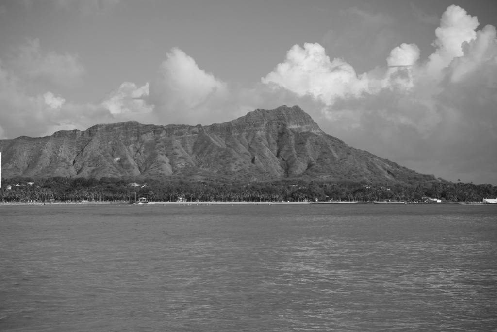
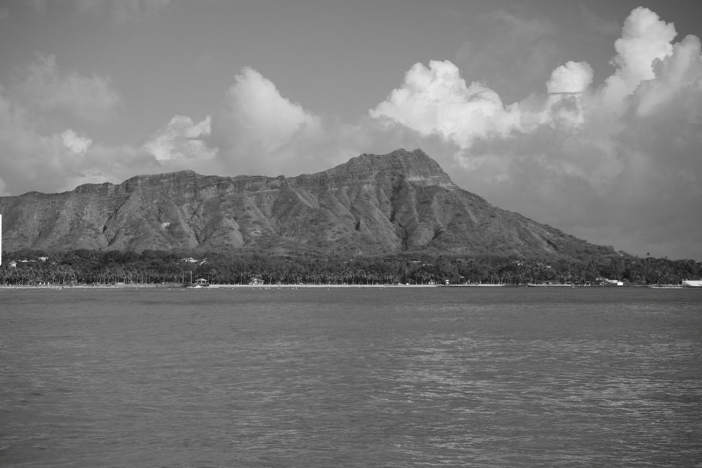

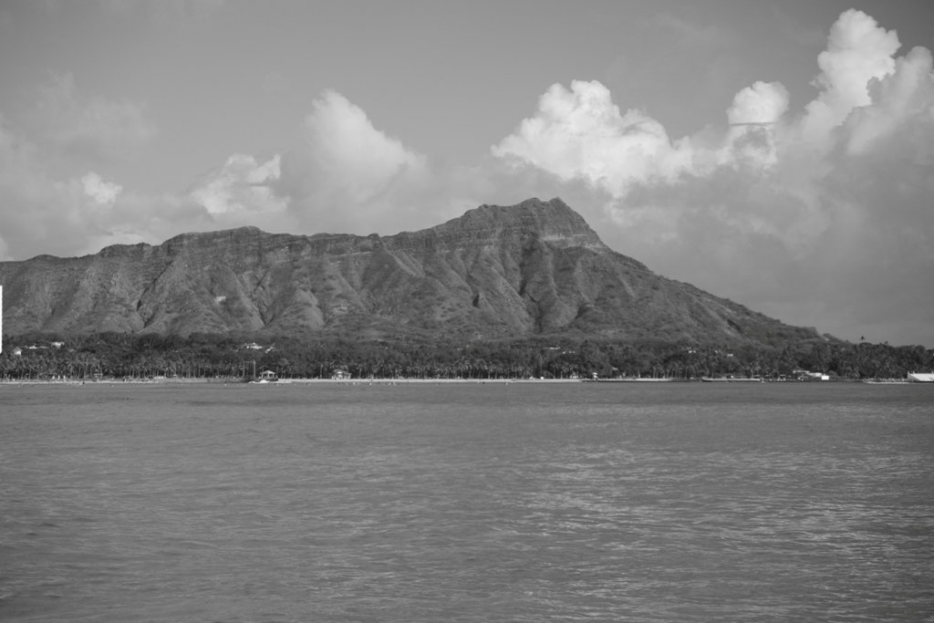
And, finally, that takes us to B&W portrait photography and the use of the green filter for enhanced skin tonal quality and contrast. In the following set, compare the unfiltered photograph followed by the green photograph beside it. Then take a look at what happens using your warmer “landscape” filters, going from yellow to orange to red. Notice how the skin gets progressively more washed out and ghostly looking when using warmer filters.
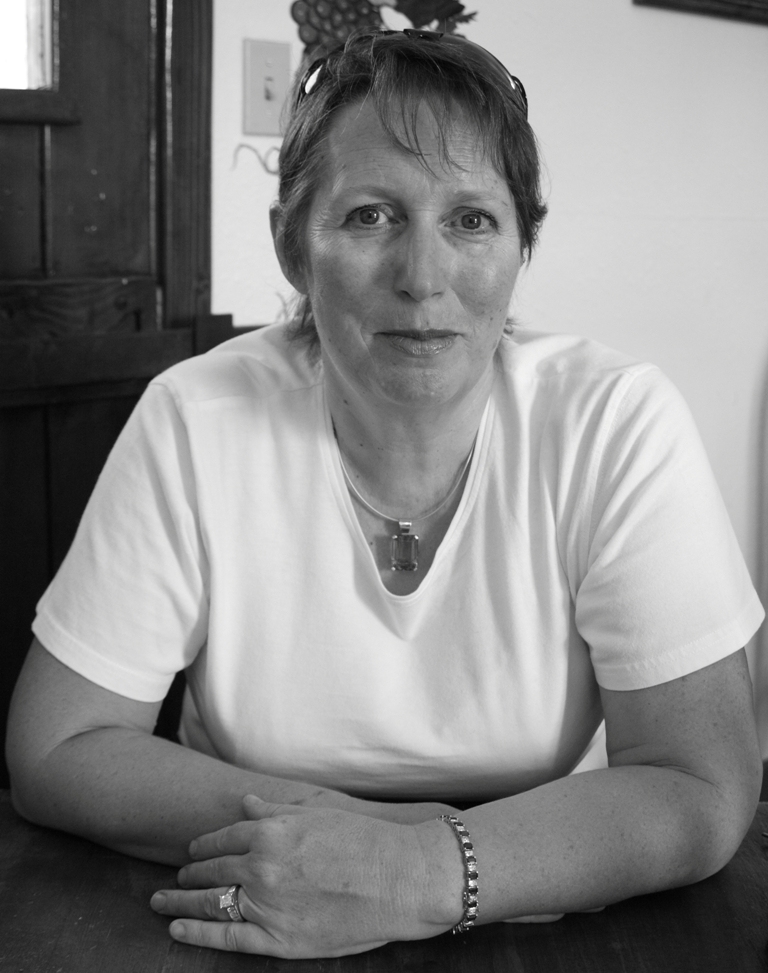
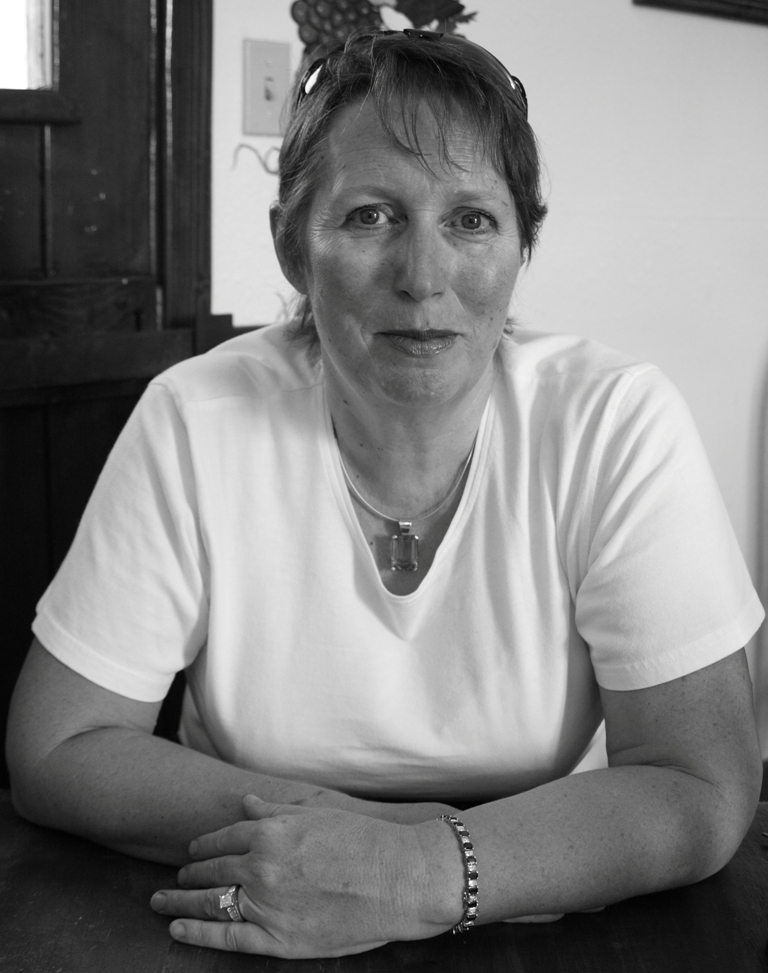
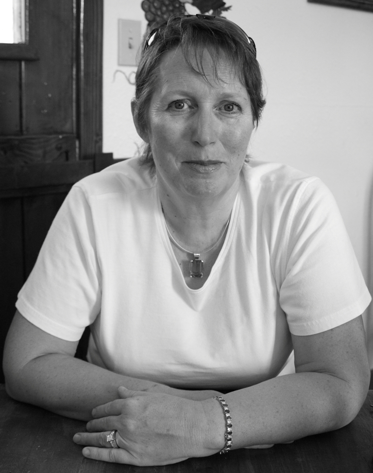
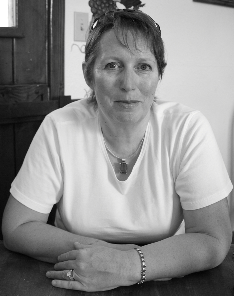
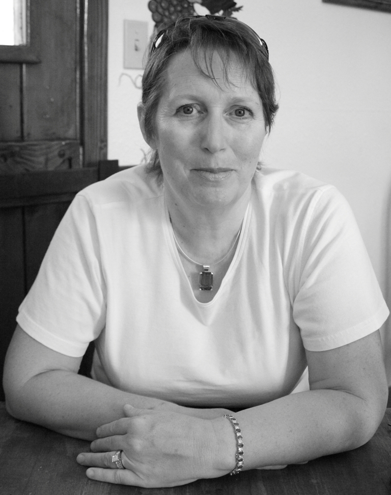
I hope you’re enjoying this week’s series on photography tips and finding them useful. If you have any comments, I’d love to hear from you. And if you have suggestions for future photography blogs, that would be really great.
Filed under Photography
 Decisions — Murder in Paradise
Mystery novel available for Kindle
0
 The Globe — Murder in Luxury
Mystery novel available for Kindle
0

