
Time for seven more of my favorite photographs in this, Part 5 of my seven-part series. There is no set theme for today’s shots. Most of the compositional rules have been previously covered. So, today, I want you to take a look at the following photographs and determine two things:
- What is the primary subject of the photograph?
- Where would you have placed that subject in the overall composition had you been taking the shot?
Near the end we’ll switch to some compositions requiring a bit more thought, such as zoom/cropping and perspective.
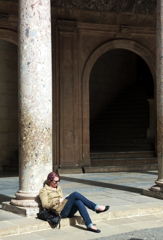
A Student of History — Rule of Thirds; Use of environment to supply context; Human interest

Somebody Missed the Boat — Rule of Thirds placement; Whimsy; Dramatic backdrop

Call Forwarding — Rule of Thirds; Use of dramatic color; Nostalgia
Here’s an example of creative zooming/cropping. In the following photograph, most people would zoom out to capture the entire vessel. But in so doing they would be losing the most important aspect of the scene — the drama of the yacht cleaving through the blue Caribbean waters off the island of St. Barts. The colorful sails are indeed a nice addition, but they are secondary to the statement of composition, and there’s still enough of the sails in the frame to make use of the added interest supplied by their unexpected color.

Yacht to Have Been There — Rule of Thirds; Secondary use of color; Action
This next whimsical shot makes use of context (the store front) and negative space framing (the surrounding blank white walls and neutral gray of the walkway).
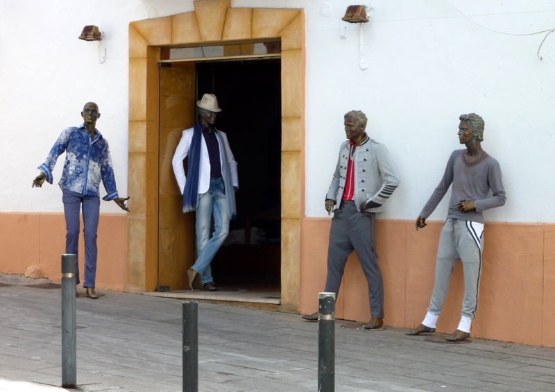
Discussing the Latest in Men’s Fashiion — Whimsy; Negative space framing
The amount of texture evidenced in this next photograph might entice you to explore the use of Black & White conversion, but then you’d lose those marvelous greens highlighted against that neutral, tannish façade (but hold that thought; we’ll get back to that with another demonstration of color filtering for B&W at the end). Also not that I resisted the urge to line up straight-on to the subject. That would have been B-O-R-I-N-G. Instead, you get an off-angle view that uses lines of perspective to draw your attention across the frame from left to right.
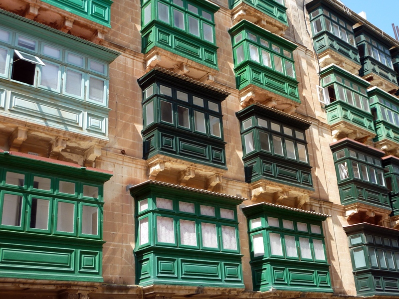
Enjoying the Balcony Seats — Use of perspective lines, color, and texture
Our seventh and final shot for today is a black-and-white conversion of a color photograph taken of the old river section of Bruges. If this case, B&W just seemed to enhance the shot on several levels. First, the scene was loaded with texture, and stripping away color makes texture the star. Second is the nostalgia aspect of the scene — quaint, centuries-old buildings alongside a gently flowing river populated by a single swan. And lastly there’s the loss of time aspect of this scene — was it taken recently, or closer to the early to mid 20th Century? You simply cannot tell looking at the clues afforded to you in this shot, but color would definitely take it into the modern era unless you attempted some creative color effects to mimic the flaws of the films of old.
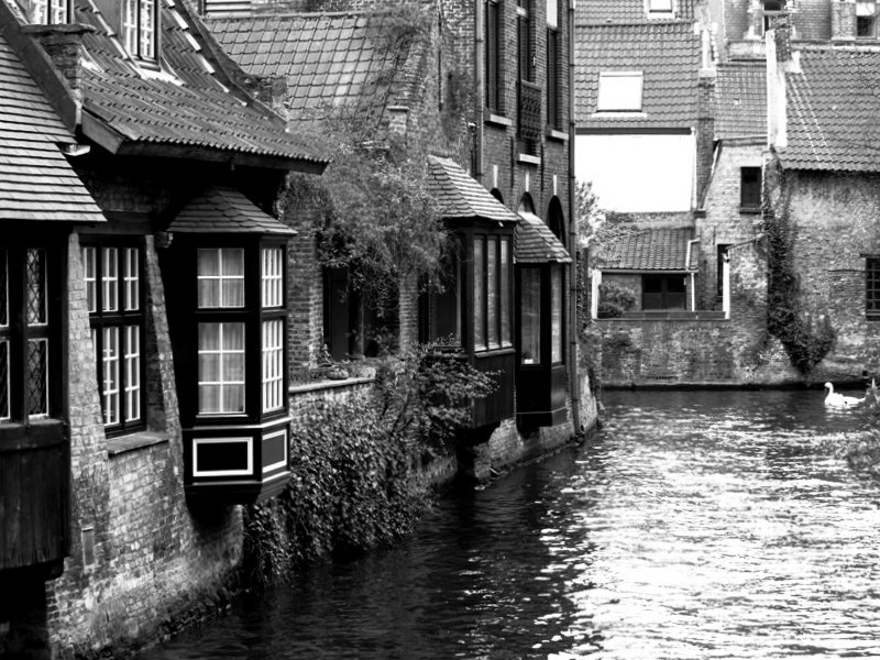
Bruges in Black and White — Use of B&W to highlight textures and enhance a feeling of nostalgia and sense of historical perspective
Now, back for a moment to that scene of the balcony-laden façade taken in Malta. — the green-dominated photograph above on which I remarked that its texture-heavy subject might make you want to consider conversion to black and white. I’ve covered color filtering of B&W conversions several times before, but this particular scene presents an ideal opportunity to demonstrate the dramatic effects of red and green filtering on green subjects (the balconies) and warm colors (in this case the brown background). Below are two B&W conversions of the same scene. The one on the left utilized red filtering before conversion, which had the effect of darkening the greens and the blue of the sky while lightening the stone façade from which the colored balconies protrude. To the right is the same image now filtered for green. In this instance, the façade is darkened and the greens of the balconies and the blue of the sky are greatly brightened. Click on one of them to bring up a gallery so that you can better view these critically important effects.
-

- Red Filtering
-

- Green FIltering
The lesson here: If you’re just converting to B&W, then you’re missing a lot of drama in your converted photograph. Learn how to filter colors before you make that conversion to get the most out of your image.
 Decisions — Murder in Paradise
 The Globe — Murder in Luxury
Great pics!
Thanks, amigo.