Monthly Archives: August 2011

When to Keep the Color—Landscapes


On Monday we took a look at what type of landscape pictures might make good candidates for black and white conversion.  All those photographs were taken in Glacier Bay on August 9 of this year, and their common themes were dull lighting, fairly monochromatic color range, misty clouds and, perhaps most importantly, rich textures with high contrast elements.

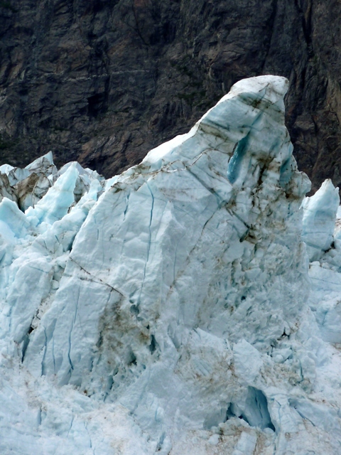
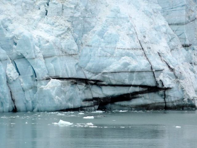
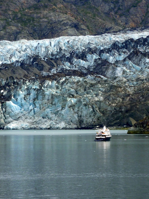
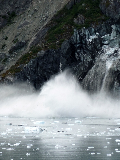
Today we’re going to look at photographs that aren’t as well suited for conversion to black-and white.  These were also taken in Glacier Bay, and on the same day.  The first three photographs depict an action sequence showing glacial calving of ice; black and white would have detracted from that action.

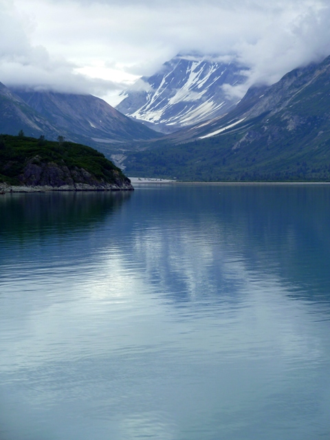
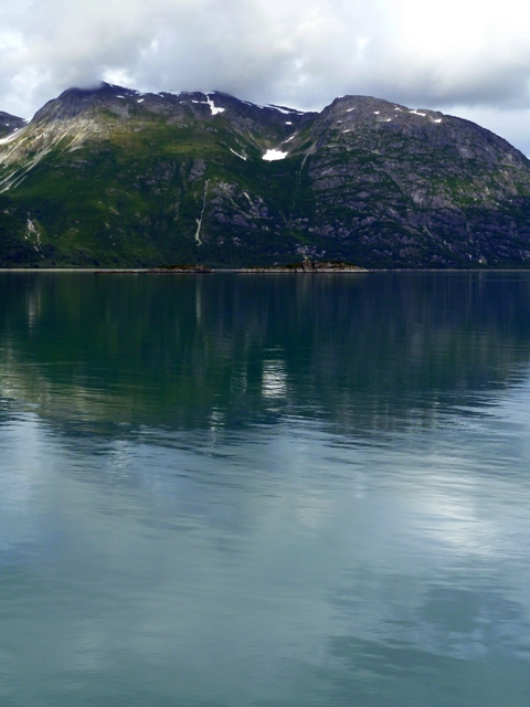
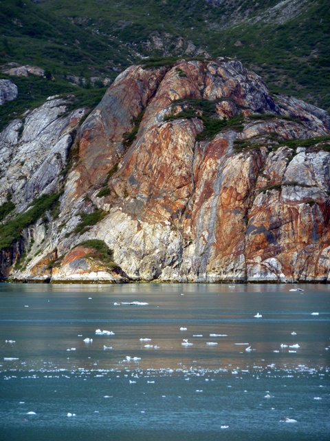
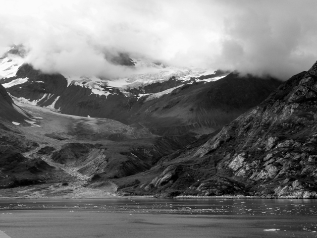
In many of the examples, you’ll note that colors play an important role in the visual impact—just the opposite of Monday’s choices.  Some are reflection shots, in which what color there is plays an important part in enhancing the reflective effect on the water.

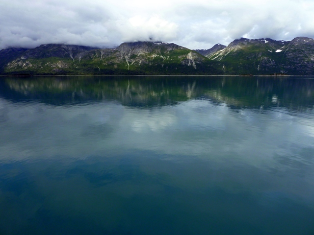
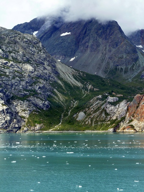
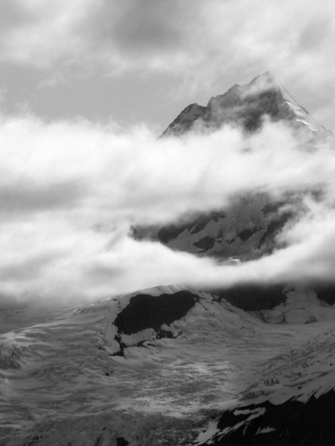
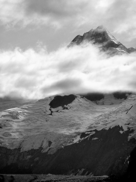
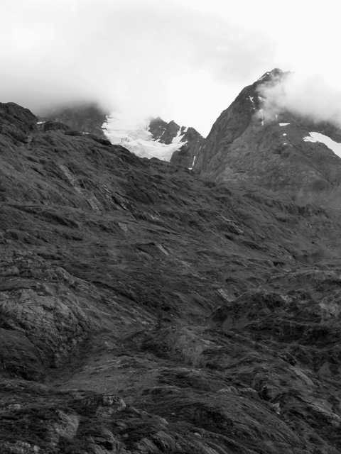
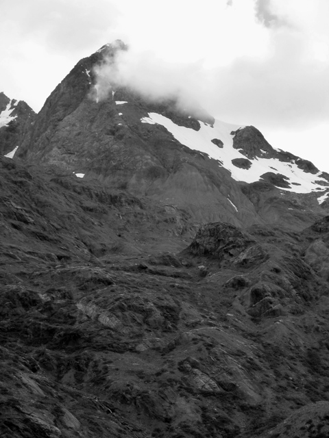
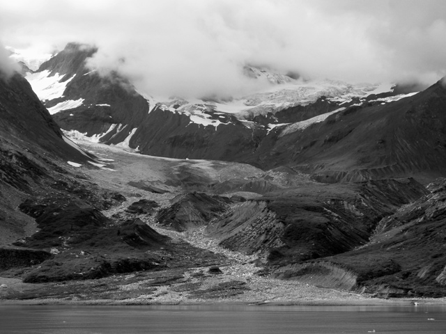
And finally, the last three photographs at first appear to be good candidates for conversion when compared to their misty counterparts from Monday, but you’ll note that because of the distant subjects and hazy conditions, they lack the contrast of last Monday’s offerings.  Thus, at least to my eye, they have more impact with what minimal color there is than they otherwise would display if they had been converted to black and white.

But, remember, it’s all a judgment call, and you’re the judge when it comes to making these decisions on your own photographs.

See if you agree with the choices made:

3 Comments

Filed under Photography

When to Convert to Black & White—Landscapes


So, what kind of picture makes a good candidate for conversion to black and white (B&W)?

Well, for one thing—when the picture contains a lot of texture, and when the subject is primarily monochromatic already.  The following landscapes were taken in Alaska’s Glacier Bay on August 9 of this year give a good example of this rule of thumb.

The weather conditions were far from ideal for color photography.  The skies were mostly overcast, and many of the mountain peaks were obscured.  Additionally, the vegetation was sparse, and the colors of what little vegetation there was were muted by the indirect, diffused lighting.  Consequently, the resulting color shots were far from impressive and were severely lacking in punch and drama.  What I had were mostly islands of dull green floating in a sea of varying shades of gray.  Dull, dull, dull.

Fortunately, these cloudy conditions are precisely those under which B&W photography can really shine through, if you’ll pardon the pun.  Cloudy, almost featureless skies can be made to pop by filtering to amplify subtle differences in shading.  Vegetation can be darkened to almost black, thus adding apparent contrast to a shot and enhancing the dull grey granite that would otherwise be lost.  And stripping away color in this case helped bring a dream-like, mystical, almost surrealistic feel to the peaks jutting up from behind the intervening misty cloud layers.

We’ve covered B&W filtering effects before in this earlier blog:  Black & White Photography—It’s All in the Color!  And, as in that previous blog, I relied solely upon Google’s free Picasa photo editing program to strip the following examples of color and apply the most appropriate color filter to obtain a higher degree of visual impact.

As previously discussed, warming filters (yellows, oranges, and reds) are those most commonly used to enhance landscapes because these filters darken blues (sky, water) and greens (trees, shrubs) while lightening the yellow through red hues (flowers, brown tree bark and animal fur )  The following pictures are no exception.  The filtering effects used here were mostly dark yellow, dark orange, and red, depending on the amount of contrast and detail needed to enhance the shot.  Gliding you cursor over the picture will reveal what type of filtering effect was used for that particular shot, and clicking on a photograph will increase its size.

Today’s blog entry is geared toward B&W conversion of color landscapes.  If there is a demand for it, I’ll do a follow-up piece on portrait conversions.  Please let your voice be heard on the subject by leaving a comment.

Meanwhile, I hope you enjoy the following photographs:

2 Comments

Filed under Photography

Mea Culpa—That’s Latin for, “Boy Did I Screw Up”


Okay, I’m going to have to go with a correction on yesterday’s blog (That John Mica—He’s Such a Tool!) thanks to the eagle eyes of blog reader Kevin Cleary.  It seems that the numbers on revenues lost during the recent FAA shutdown are so mind-boggling that I mentally multiplied that actual damages as I was writing.  The real numbers are bad enough, but I made millions into billions and billions into trillions.  That is an unforgivably sloppy mistake on my part, and for which I apologize to my audience.

I shall endeavor to do better in the future.

At any rate, the corrections are posted.  If you stopped by to view the original, you might want to go back and check out the corrected figures.

Again, my apologies.

1 Comment

Filed under Author